
What is the purpose of your landing page or website?
Are you getting the actions you desire from your visitors?
Using the right call to action gets websites and businesses what they really want—conversions.
Not all calls to action (CTAs) are created equal. Every site should test and tailor their individual CTAs to best suit their audiences.
Below we’ve pulled together 5 CTA best practices every business should keep in mind when designing their website CTAs.
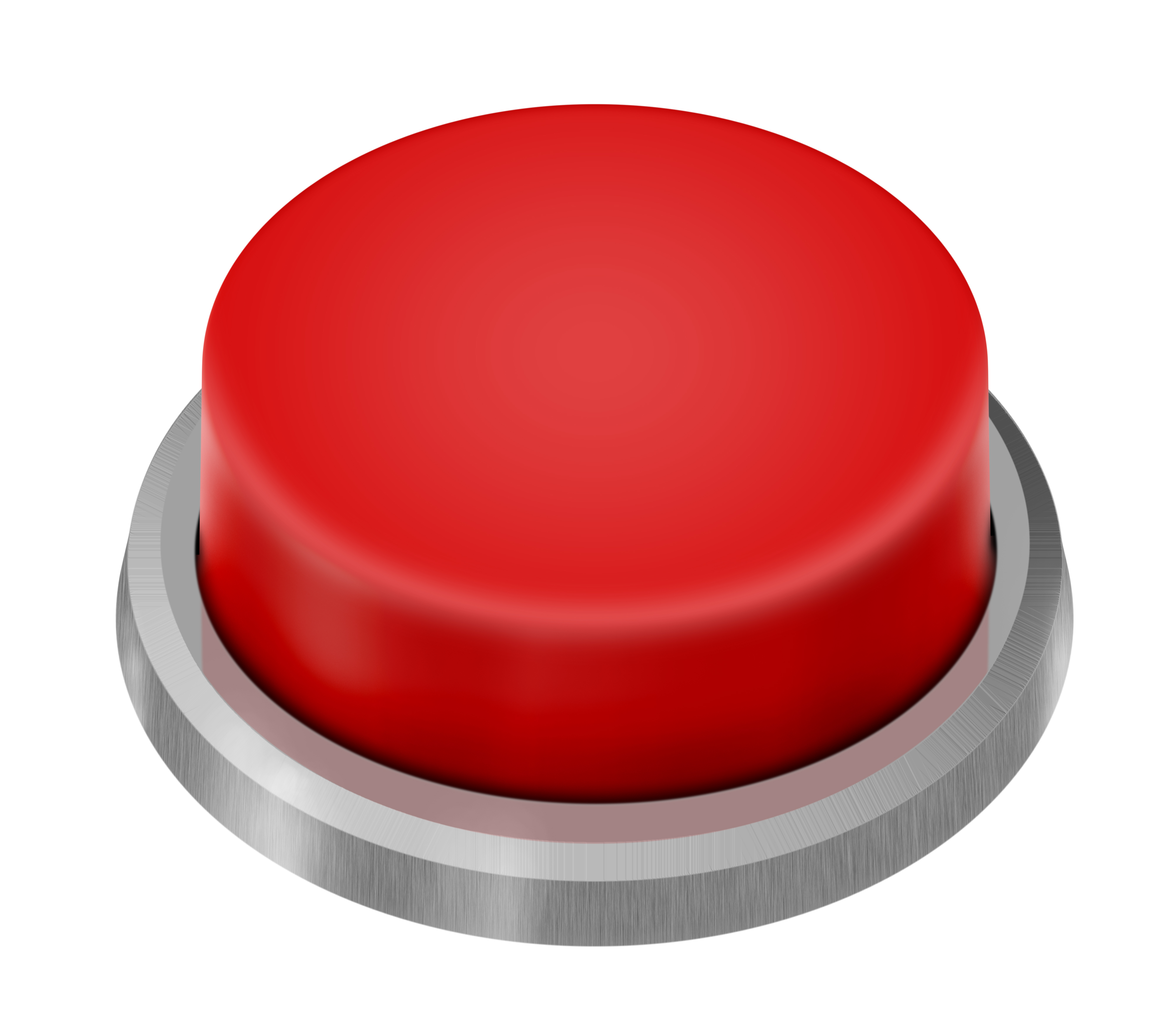
1) Make it POP!
Color
Your call to action should call attention to itself. A brightly colored CTA button is easy to find and attracts the eye to it. It shouldn’t necessarily be obnoxious (over-sized CTAs actually generate fewer leads), it just needs to be obvious and easy to find.
Pick a color that attracts the eye and doesn’t blend into the rest of the website. The best way to do this is to use a color that contrasts with the primary colors of the site, while still fitting in with the general color scheme.
If your logo is a contrasting, eye-attracting color already, using that same color for your CTA will visibly reaffirm what it is your users are signing up for. Using an accent color from your brand color palette will also do nicely.
Shape
When it comes to creating a CTA that converts, buttons are best. According to Hubspot, users are conditioned to recognize clickable elements. Button shape is one of the few things the web design world agrees on. Always use a rectangular button with rounded edges. We’ve learned to shy away from sharp edges (most of us, anyway) so keep those corners round!
2) Who is your target?

Bullseye.
As with archery, darts and SEO, you need to pick your target before you let loose. Otherwise, who knows what you’ll hit? Here are some questions you should ask yourself before you craft your CTA:
- Who are you aiming for? Which sort of user are you hoping to attract to this particular call to action? What do they want? What do they react to? Example: You are trying to sell tickets to a band popular with the 18-34 set. Your target is millennial concert-goers.
- What do you want your user to do? Do you want them to buy a product, register for a webinar, signup for an email list or accept a free offer? You want your user to buy tickers, so make that clear.
- Why should they act? What is in it for them? Are you making the benefit to them abundantly clear? Think about why your user is here. A trendy, young music lover might respond to “Catch the hottest act now”, because seeing popular acts is why they are browsing ticket sales. Bonus if you add an incentive.
- What is your end goal? Adding to the email list? Selling a product? Giving out samples? Establishing trust? Is your message consistent with your goal?
3) Compelling Copy
Brevity being the soul of wit, we want to keep all copy clear and to the point. This is especially important in CTAs, because we are trying to create action from impulse. See that button? Click it.
You know you want to.
Too much copy bogs down the mind and makes the user less likely to take action. So be brief, but make sure you get the message across.
Since we are trying to create action, it is best to use our friend the verb. The key here is not to sound too bossy, or the user will feel pushed. Use encouraging or gain-based verbs like “Try”, “Claim” or “Get”.
“Claim” is an especially useful verb for a call to action button because it creates a subtle sense of urgency. A sense of urgency can be the difference between a user ‘thinking it over and coming back later’ (translation: coming back never), and a user clicking through now. Framing your copy in a time-sensitive manner using phrases like “Today only”, “Now”, or “While supplies last” creates a fear of missing out and motivates users to click.
Other types of fear-based copy are to be avoided. In the cases of free trials, people often worry that they will be unable to opt out once payment starts, or that they will somehow be charged anyway. Include some (brief) text around or within your CTA about how you can cancel at any time, or how no payment information is necessary, and you may calm these fears enough to generate a new lead. This sort of reassurance in CTA copy is called a ‘click trigger.’
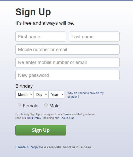
This is Facebook’s call to action. Notice the text right under ‘Sign Up’? ‘It’s free and always will be’. What a relief!
Lastly, a proven way to generate more conversions is to use first person. Michael Aagaard of Unbounce did a study showing that first person copy generates more conversions than second person copy. In one case, 90% more conversions!
Don’t just swap out “your” for “my”. Think like the user. What are they thinking? Did they come to your pet shop site because they wanted to make the wise investment that is a puppy, or are they a dog lover who really wants that furry friend?
So change “Proceed for your free offer” to “I want my free puppy” and watch the conversions roll in. After all, it’s different, unexpected and who doesn’t love that?!
4) Placement
That’s right, location, location, location!
Your call to action needs to be visible to your user—and at the time when they are most likely to click through. That means it doesn’t necessarily get placed above the fold (the folks at Instapage agree) where a new visitor to the page will see it first. Instead, maybe it follows that compelling blog article you wrote on just the same type of software for which you are now offering a free trial.
Your user won’t scroll around looking for your CTA. It needs to be right before their eyes at the right moment. So consider your user’s journey when placing the CTA button.
[Tweet “Users won’t look around for your CTA. It needs to be right before their eyes at the right moment.”]
If they are reading our example software article, try a slide in CTA about midway through. They’ve proven they are invested by reading, and you don’t risk missing them if they click away at the end.
Also, when it comes to CTA placement, don’t have multiple calls to action vying for your user’s attention. Present them with too many choices, and their choice just might be to bounce off your page.
5) Test Your Call to Action
As we’ve mentioned, nothing is a one-size-fits-all solution. What works best for one website might need a little tweaking for yours. Always test your CTAs to see what works and what doesn’t.
[Tweet “Always test your CTAs to see what works and what doesn’t.”]
The tried-and-true method is of course A/B testing, also known as split testing. While A/B testing may require a little more time and effort, it is accurate and hones in on specific traits that do or don’t work. It is important to remember when performing an A/B test to only change ONE thing between the two pages. Otherwise, you won’t know which is affecting your results.
If you don’t want to test in-house, check out these 10 A/B testing tools on Mashable.
We can’t overstate how important an effective call to action is to your website. So if…
- you feel your calls to action aren’t generating the leads they should, and you don’t have the resources to devote to lengthy testing
- your website needs a little extra help bringing home the bacon
- you have the sneaking suspicion that it’s time to rebuild your site with inbound lead generation in mind
…then request a complimentary website audit. Learn how partnering with Harp can take you to SUMthing greater.