
What is a landing page?
A landing page is where all your inbound marketing efforts are celebrated. You’ve invited your party people (aka members of your target audience) to join in on the fun by writing keyword-infused and gripping blog posts, Google Ads campaigns, social media content, press releases, email marketing and more. While these invites were delivered through various online channels, they all directed your audience to a one location—a web page built around a singular, focused objective.
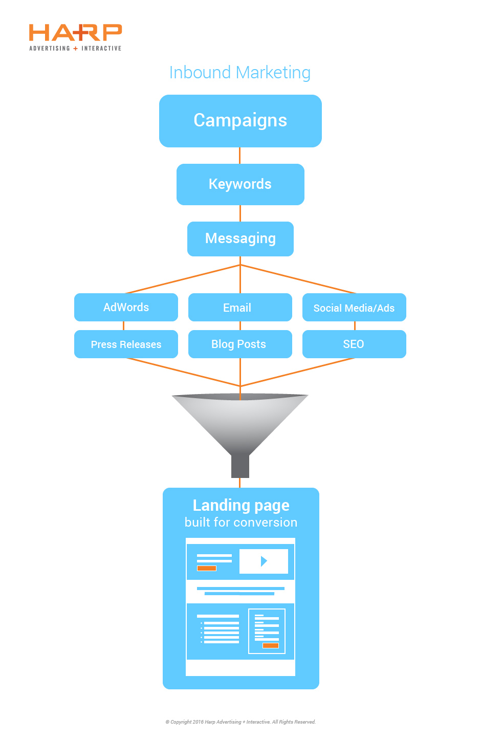
But don’t explode the confetti yet. Just because you gathered a crowd on your doorstep doesn’t mean they’ll come inside for cake. In other words, you want your visitors to take a highly targeted action upon visiting your landing page (rather than just passively viewing it and heading out).
Improving your Landing Page Conversion Rate
To increase the chances of your visitors converting into quality leads for your business, we’re sharing key tactics we’ve put to the test to help increase conversions on your landing page. Let’s get this party started.
10 Landing Page Best Practices
1. Incorporate Authentic Testimonials
Social media has increased the expectation and need for peer influence, and has perfected the concept of virtual word-of-mouth advertising.
We have a tendency to trust our peers’ opinions more than we trust advertisers’ statements about themselves. And we’re used to making consumer decisions based on the ubiquitous nature of peers’ promotions through social media.
With that in mind, it makes sense that we expect and trust real testimonials from real people in today’s marketing. Add real testimonials, and images that reflect your targeted audience, to your landing page—and up the trust factor and conversion rate.
2. Videos…Use Them!
According to sources, including a video on your landing page can increase conversions by more than 80%.
Optimizing a landing page with a video boosts conversion rates by over 80%. Share on X
Just think about it…it makes a lot of sense.
Watching a video on a landing page requires minimal effort from your visitors (who can multi-task while watching and listening) while simultaneously keeping them on the page longer, resulting in additional time for your message to seep in. Highlighting the benefits of your offer in this visual/audio format helps seal the deal in your visitors’ minds – leading them to take the desired action for which the page was created.
Adding videos to your landing pages will also help your target audience find your content organically. Experience have shown that landing pages with videos optimized for SEO have an increased click-through rate.
In other words, videos assist your landing page to qualify for higher rankings in search engines, making your landing page more easily found and desirable for readers.
3. Popping Call-to-Action
Direct attention on your landing page to its one desired action by inserting a call-to-action button in a color that contrasts with the rest of the page, preferably a warm color (red, orange, yellow). For example, if the page is primarily designed in blue and green, use an orange call-to-action button to stand out.
4. Short Submission Form
The best landing page is a dominant lead generation tool for your business. In order for visitors to receive the offer the page is built around, you need to include a form to collect their contact information. It’s a trade-off with each party (see what we did there?) getting something in return for their action.
Keep in mind that the form is not meant to help you learn the visitor’s entire life story. Ask for just enough so you can reach out later for additional info (you know, once they’ve joined the party and had a slice of cake too).
A good rule of thumb is to limit the required information to no more than seven fields. And hey, if you really only need a name and email address, it’s perfectly acceptable to keep it that simple. In general, the simpler the form, the more likely a visitor will complete it.
5. Follow the F Pattern
Eye-tracking studies, such as this one performed by Nielsen Norman Group, consistently find that people read web pages in an F-shaped pattern, that is, in a vertical stripe down the left side of the screen and two horizontal stripes across the top of the screen.
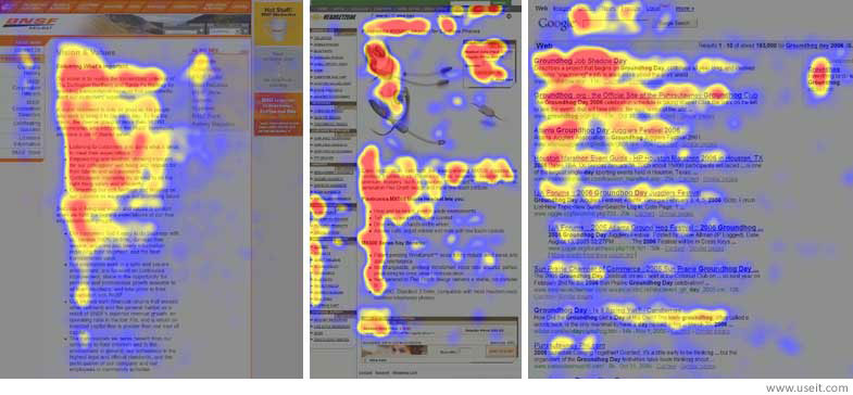
The heat map graphic shows red where users looked the most. Yellow areas represent fewer views and the least-viewed areas are in blue.
How can we apply this knowledge to landing pages? Relay important information and the key benefits of the offer in the top left area of the page, with the form on the right side. This layout allows visitors to learn the most important information first, which will then naturally lead them into filling out the form.
6. Forget the Navigation Bar and Avoid External Links
Limiting exit points on the landing page is integral to funneling your visitors down the desired path, whether it’s filling out a form, downloading an e-book, signing up for a webinar (you get the idea).
You’ve worked hard to drive traffic to this one spot, so now you want to keep them here to fulfill the page objective. Without any navigational elements and relevant information easily formatted, visitors are left with one option: convert!
7. Coordinated Campaign Materials
You wouldn’t send out princess-themed invitations and then decorate the party with dinosaurs; that would just be confusing (even though dinosaurs are the bomb).
Dinosaurs aside, it’s important to design a landing page with a similar look (colors, font, imagery) as the marketing materials which lead visitors to the page in the first place. Visitors who clicked through to the landing page already found the messaging and visuals on the ad appealing, so be sure to maintain that connection all the way through to the end of the conversion process.
8. Mobile-Friendly is a MUST
We all know how much we use our own smartphones. Newsflash: your audience uses them too.
Ensure your landing page is built with responsive code and design to optimize the interface on mobile devices. Double, no, triple check that the form fields are easy to fill out on a phone or tablet (any difficulties may discourage visitors from staying on the page due to usability issues).
9. Easy-to-Remember URL
A short and memorable landing page URL is particularly useful when marketing to your audience with print materials (as opposed to digital marketing, in which case your audience would likely never need to keystroke the URL). If the URL gets too complicated, people may have trouble finding the landing page, and then obviously won’t be able to convert.
Short, redirect URLs can be created to simplify this process. It will be easier for your target audience to remember and creating unique URLs help you track incoming traffic by source. It’s a win-win!
10. A/B Testing
Last but not least (in fact this is like super-duper important), test test TEST your landing page to increase conversions. After all, there’s no cookie-cutter landing page that works for every brand and every audience.
When testing your landing page, it’s critical to only change one element at a time so you can attribute increases or decreases in conversion traffic to that specific element. Switch a color, change a headline, change the offer—whatever you do, keep testing and comparing the results. Learn what works and what doesn’t to improve the conversion rate, which improves your ROI.
Keep in mind that landing page testing is a strategic, ongoing process. Even when you think you’ve found the sweet spot, keep testing!
Depending on how much traffic is directed to your site, a good rule of thumb is to test a version of your page for a minimum of one to two weeks. If version A performs better at the end of the testing period, keep it the same and make a single change to version B to run for the next testing period.
I’m ready to throw a party—dinosaurs, confetti and all!
Like hosting a perfect (virtual) party, plenty of planning goes into perfecting your landing pages. Ensure your page is ready for the visitors whom you’ll be spending time and money to attract. Want a little help planning that party? Reach us. We’ll have that party-planning, rock-that-dinosaur-and-confetti-thing going in no time.